1. How would you describe your style of designing logo? In a course of a logo design project I try my best to design an appropriate solution. Although I always strive for simple and memorable design that would serve the client needs as long as possible.
2. What’s your favorite logo (that you created) recently and why? Battalion is company using the power of technology offering its customers simplified, secure, real-time lending decisions and aims to change the way people get residential financing. I wanted to design a memorable logo communicating that there is a simple solution in the complex process of residential lending financing.
3. Is it typical of your style or something new? Here are few other examples of my work. Let the readers judge.
BioHackr Health (Health clinic)Ali Reviews (Product reviews application)Peak (Software)Hedgehog (Non-profit)
4. What is your favorite logo that somebody else designed recently and why? Hard to answer. There are so many inspiring examples but here are two:
Baby book by Andrii KovalchukPoem EM by Alen Pavlovic
5. What is your favorite logo of all time and why? Maybe the one that stood out in my mind from my early childhood is the Stefan Kanchev’s logo done for the Bulgarian national television. It represents a simple “Б” and “T” monogram for Bulgarian National Television (Българска Телевизия in Cyrillic) in the form of early days tv antennas. Just a brilliant idea.
Bulgarian National Television logo designed by Stefan Kanchev, 1965
Alex Tsanev Alex has spent the past six years designing and art-directing the identities of various businesses around the globe. He has experience working with brands like Google, British Telecom, Phillips, Lufthansa, Teva Pharmaceutical Industries, etc. Some of his work is featured in design-related platforms like Behance and Dribbble, and some could be seen in printed editions as well.
1. How would you describe your style of designing logo?
Others can judge this better than me, but I hope my work doesn’t have a style. The outcome of any project should depend on the client and the brief rather than the taste of the designer. That said, the most enduring logos are simple in appearance, with just enough detail to separate them from competitors, so I aim to create marks that are easy to remember after a quick glance. But that’s not a style. That’s doing my job.
2. What’s your favorite logo (that you created) recently and why?
I’m putting the finishing touches to a redesign for a cycling team in Mexico. What I was especially happy about was how the client agreed to the idea after seeing a quick symbol sketch. He’s since seen a digitised version and is keen to implement it as soon as possible. I’ll add the work to my portfolio shortly.
3. Is it typical of your style or something new?
That goes back to question one — it’s simple enough to endure, but with enough detail to be distinctive.
4. What is your favorite logo that somebody else designed recently and why?
From time to time I’ll share a few on Logo Design Love, like the Bandido design by Magpie, New Chapter by Paul Belford, Australian Design Radio by Christopher Doyle. There’s so much design talent out there. So many good ideas.
Bandido Coffee by MagpieNew Chapter by Paul BelfordAustralian Design Radio by Christopher Doyle
5. What is your favorite logo of all time and why?
I couldn’t pick just one, but Daniel Eatock’s alternative London 2012 design is the first that comes to mind, or the symbol for the Guild of Food Writers by the late 300million.
Alternative London 2012 by Daniel EatockGuild of Food Writers by 300million
DAVID AIREY Is a graphic designer, writer, and brand consultant, hired by clients of all sizes, from multinationals to companies of one. Since opening his business in 2005 he’s created logos and visual identities for brands in more than 30 countries. See more of his work here: https://www.davidairey.co
As part of an ongoing series I’ll be posing the same questions to various logo designers that I admire starting with Michael Shumate, author of Logo Design Theory (see below).
1. How would you describe your style of designing logo Simple and solid, avoiding the Seven Deadly Sins of Logo Design ((see his book Logo Design Theory below))
2. What’s your favorite logo (that you created) recently and why?
Sustainable Forest Alliance (Non-profit)
Sustainable Forest Alliance (Non-profit) This is an organization of wood lot owners and forestry industry workers interested in creating an organization dedicated to sustainable forest management and helping people get away from the clear cut forestry model which is dominant in the industry. Their method of sustaining is to diagnostically harvest dead, diseased and mature trees in a mixed forest while preserving the diversity and healthy growth as well as the health of the forest soil.
I wanted to design something that would give instant recognition that they are about trees growing. This logo was the simplest way to convey that idea.
3. Is it typical of your style or something new?
You judge. Here are a few of my latest logo designs.
Island Wide Hospital Access (Non-profit)WM Services (Cottagers’ Property Management)Freedom Forum PEI (Non-profit)Maritime Stone and Timber (Construction)
4. What is your favorite logo that somebody else designed recently and why?
There are hundreds of logos that are now being designed or redesigned in conformity with what I call the Core principles of Logo Design. There are too many to choose from.
5. What is your favorite logo of all time and why?
Apple. Designed in 1976 by Rob Janoff. Originally it had rainbow stripes but they went for the flat black. All other versions since then have been merely treatments. Look at the Apple website and all you’ll see is the flat color version, usually just 31 pixels wide. It holds up at any size and over many decades. It’s timeless. This is the qualities that the Core Principles promote.
———————-
Michael’s Bio A. Michael Shumate BFA, RGD Emeritus Professor Emeritus Graphic Design Logo Design Theory Evangelist & Trainer
Michael is a designer, a teacher and trainer and the author of “Logo Design Theory: How Branding design Really Works.” He has designed identities in all areas of branding: commercial, government, institutional, product and retail.
He taught graphic design and illustration for twenty-five years at St. Lawrence College and is now Professor Emeritus. He is also RGD Emeritus (Registered Graphic Designers of Ontario).
There are some who say, “Those that can, do, and those who can’t, teach.” That may apply to some teachers. (You can judge for yourself with Michael’s Branding Portfolio below.) But there is also another old saying, “The teacher learns more than the students.”
While teaching Branding Design he had about 900 students over 25 years and had to grade over 2700 branding projects. That helped him discover fundamental principles of identity design, the Core Principles of logo design, that remain true, regardless of current fads or fashions as well as what to avoid in designing a brand.
During that time he also saw that some of the identities by designers like Paul Rand, Saul Bass, and Chermayeff & Geismar that have lasted for decades – some for over a half century – but still look modern and fresh. Why? Because they conformed to those Core Principles of logo design.
Teaching is Michael’s passion, to pass on what he’s discovered.
He does it with convincing visuals, plain language and a healthy dose of humor.
2021 was a great year for me in terms of logos I created so I thought I’d highlight my favorite 5.
Appendix N Book Club
I started listening to the Appendix N Book Club podcast this year which reviews the various books that inspired the creation of Dungeons and Dragons. The logo had to represent the low fidelity look and feel of D&D back then (late 70’s/early 80’s) rather than the highly polished version of the game that exists today. I thought about having something intrinsic to both D&D and reading so I hit upon the idea of using the 11 eyed Beholder creature engrossed in reading one of the Appendix N books.
Why I like it This one was equal parts fun and nostalgia. It was great to bring a Fantasy creature to life in this logo and at the same time a chance to style something that looked like it was from that era. The bold colors, more acceptable in the Fantasy genre really made it pop too although I really liked the black and white version as it looked very much like the 70’s era illustrations of the original rulebooks.
This project was a self directed offshoot of another project and was inspired by a conversation with a friend. We thought it would be a good experiment to see if adding a rodeo cowboy to any oversized object would turn them into an intriguing and whimsical version of it.
Why I like it This was 100% fun. I simply streamlined my own pre-existing cowboy image, added the lasso and banana. I normally don’t use yellow so this was a color stretch for me too.
I did 5 logos for Google this year and of those this was my favorite. This particular one was for an internal summit for sales teams. The pathfinders direction comes from the summit’s theme of finding a way forward following the big shifts in market and career tracks caused by Covid. One of the stakeholders had been a forest ranger and loved the concept of the piled stones as route markers saying “when you’re lost on the side of a mountain during a storm there’s nothing more reassuring that seeing those helpful pile of stones”.
Why I like it The key with all Google logos is simplicity. There’s more detail in this one compared to most of my previous Google logos (i.e. the texture on the stone) because it looked too plain without it. As with all Google logos there’s also the design problem of getting all 4 colors into them and while making it look harmonious. Despite that I really liked the black and white version more.
This fun logo was for a table top (roleplaying) gaming company whose focus was on imaginative worlds. such was a dreamscape. I drew upon some of the imagery of the French surrealist artist, Odilon Redon.
Why I like it This logo was highly effective with very few elements in it i.e just a very simplified eye and clouds. What piques my interest even more is the use of negative space to create the eye.
This was a personal project that re-examines 4 mythical women that are often depicted in popular culture in a way that is very different to how they were originally intended.
Why I like it I loved each of the stories which is why I chose them. This is probably why others related to them so much as well. To create each one I applied Adobe illustrator’s image trace feature to different images found online in order to recombine them into something new. While the black imagery provided commonality amongst the four images each one I was also able to give them a distinct color palette and type style.
Since most designers spend a great deal of time looking at and choosing stock photos for various projects I thought I’d create a post covering a (very) brief history of stock photos.
London Illustrated News uses etchings to portray events in the far flung places across the globe. Etchings were used since there was more creative license and photos could not be printed.
Halftone printing allowed for photos to be used in mass print production for the first time e.g. this promotional photo of the Chicago White Stockings, 1888
30+ years later planned news photos were being taken for wide distribution in the news media. This example is from the Solvay Conference in 1910 (Albert Einstein is second from the right).
The first stock photo in 1920 was titled “Group in Front of Tri-Motor Airplane”. The model releases meant that photographer H. Armstrong Roberts could distribute the images from this shoot as saw fit. The streamlined silver plane was the height of technology at the time and much in demand so Roberts could call on ad agencies and publishers to sell the rights/negs.
Otto Bettman escaped from Nazi Germany in 1936 with15,000 photo negatives in several suitcases which he used to set up the Bettman Archive. It was a physical place that you went to in order to search through drawers of photos. The archive was later bought by Corbis.
Sir Edward Hulton 1945 commissioned Charles Gibbs-Smith of the Victoria and Albert Museum to catalog the entire Hulton archive (mostly news photos from Picture Post newspaper) using a system of keywords and classifications. The Gibbs-Smith system claims to be the world’s first indexing system for pictures, and it was eventually adopted by the British Museum collections.
The Tony Stone 1995 Big book-like catalogs were distributed to design studio, ad agencies and news outlets. Searching was by hand, often with the use of post-it notes to return to later. Images were photocopied and later scanned to put into mock-ups for clients.
As desktop publishing exploded in popularity CDs filled of low budget royalty free photography started appearing around 1995. These allowed images to be on individual designers’ computers in advance of usage and no longer required a lengthy process of approval and payment.
iStockphoto launched in 2000 allowing masses of low cost images to be accessible online. Other microstock websites started appearing shortly afterwards and mass acceptance within a few years made online instant selection and purchase of the images as the only way to do stock photography.
Photographers now had more outlets to sell various outtakes from photo shoots so an overly ‘stocky’ look started appearing at the lower end of the market. An easy online process for payment and uploading images allowed the servicing of a world market in stock photography.
Throughout all this the stock photo libraries continued to make a huge amount of income from the news and editorial use of real world images images.
Smartphones meant that everyone has a camera in their pockets with which to record newsworthy moments. In 2017 United Airlines learned that anyone can upload footage not just to individual social media profiles but also to news network sites.
Aiming for safe bankable options the stock photo market became flooded with images like these above that have formed most people’s concept of what stock photos are: inauthentic business settings (and a lot of teeth).
Playing on the common perception of stock imagery iStock teamed up with the marketing of the movie Unfinished Business to allow consumers to use these altered photos free of charge for 3 months around the time of the movie’s release.
Larger and more sophisticated companies now have their own photo libraries, in this case Oracle’s, which emphasizes authentic moments in real settings.
Our lives are increasingly seen through the window of a small glass screen. Not surprisingly the people who shape our intention as we look through that window, product designers, are in great demand. As more apps and sites appear daily there is a huge gap in the need for experienced product designers than what the design industry can organically produce.
With this ‘product designer gap’ in mind I set up a panel discussion on September 20th 2017 to explore the topic as part of the AIGA’s Design//Work panel discussion series titled Getting Into Product Design. The panelists were Hillary Lindeman (Product Designer/Google), Deny Khoung (Founder/Whitespace), Faith Bolliger (Sr. Director of Product Design/SoFi), Loredana Crisan (Product Design Manager/Facebook Messenger), all moderated by the wonderful Amy Stellhorn (Founder/Big Monocle).
“I’m quite bullish when it comes to the longevity of product design” Deny Khoung (Founder of Whitespace)
What is product design?
Previously product design referred to physical objects being created in a factory somewhere for mass sale in a brick and mortar store. It came with a great deal of legacy knowledge about the materials used (steel, plastic etc) and/or anthropometric aspects of how the object fits the human shape and lifestyle.
However when it comes to the digital experience that weaves it’s way through our average day product design is used to shape our access to services such as finding out what the weather will be like tomorrow to finding a parking space in a built up city. Neither app creates the real world ‘product’ but merely offers the ability to know or book said analog experience.
With shorter attention spans than ever and tens of thousands of apps available there becomes a kind of app war for each category as they disrupt the previous, more analog version of a similar service or create an entirely new service that never existed before. With this highly competitive explosion of apps, product designers are being used to deliver a service to a user with the least amount of visual and mental friction in order for the business to survive and be profitable. Fingers mean funds.
As Deny put it “It’s a great time to be product designer, especially in San Francisco ((where the talk was held)). For example you could work on Facebook Messenger like Loredana and touch 1.3 billion people’s lives. You have a chance to work on something that big or a rocket ship that may become that big one day.”
““I spend as much time white boarding as I do on the computer.” Faith Bolliger (Sr. Director of Product Design at SoFi)
What’s so different about product design?
With product design you’re not creating something finite like you are in other forms of design but rather it is something that needs interaction on the user’s part. Gone are the days when you could expect a reader of something analog to work their way through long instructions. The information was presented from front to back, top to bottom, left to right.
Now users pull information from multiple data sources onto a page that exists purely in that moment. That information needs a framework imposed over it as users want to asses the data quickly and choose a course of action with just a click. As a result buttons on every page should be similar so that the user isn’t frustrated by spending extra brainpower working out which is the right button. Rather, they should be spending the time working out which is the right content or course of action they want to take.
This means the overall structure a product is presented in is almost as important as the product itself. This can create a great many pages/screens and options. In the process this obviously creates a whole different set of axioms in which to operate: “Design thinking for product design is about designing a system that is the foundation you are building on” says Faith “for example the component library must be consistent. As a result there ends up being lots of arguments about whether something is MVP (Minimum Viable Product) or not”.
The other key aspect of product design is fact that it is never finished. Like a living organism a product and how it’s users’ interact with it changes over time. Faith went on to say “I heard designers shouldn’t be attached to their work. I disagree. The better and harder skill is to know when to walk away from your work with grace. You have to pivot with feedback or if you learn something new in a usability study. Essentially you have to fail gracefully.”
“The key is to articulate the problem and it’s context in order to to sell your idea” Hillary Lindeman (Product Designer/Google Assistant)
What hard and soft skills do product designers need?
As with most jobs there are hard and soft skills needed to thrive in a product design job. For the software part of the hard skills needed Hillary had this to say “At Google every designer uses Sketch for wireframes and user journey flows to have that high fidelity. We also use Principle to prototype and an internal prototype tool similar to Origami.”
Meanwhile Loredana mentioned the need for these software skills on her team “Facebook uses Sketch for just drawing the pixels. We also use Framer and Origami.”
When looking at potential candidates to join their existing product design teams Hillary had this to say about the soft skills needed: “Storytelling i.e. how you communicate beyond the screens. How do you put it in a larger perspective. The key is to articulate the problem and it’s context in order to to sell your idea.”
Hillary also added: “You need to be able to collaborate and communicate well with cross functional teams as you will work with product managers, developers and research teams. You need to develop good and strong relationships. People who are good at those skills create good workflow.”
Meanwhile Loredana added this about prospective candidates: “We need to see intentionality – that each choice is intentionally made. That they ((the candidates)) understand all the possibilities and the intent of projects. We also need to see self awareness of where they are in their career, can they move beyond this point and have the drive to get there.”
“You have to be attached to outcomes, not designs, because that’s what you create” Loredana Crisan (Product Design Manager/Facebook Messenger)
What is product design workflow like?
Since the scope of a product design project is so large and involves many other teams such as Engineering, User Research, Marketing/Sales etc the average week of a product designer involves a lot of meetings. These could be stand-ups or follow the Agile method so that ideas can be whiteboarded or designs presented in a quick and efficient manner. In between those meetings a product designer may only get sporadic slots of 30-60 minutes to read emails or do actual design work. As a result it’s hard to carve out enough time to do a deep dive into a problem. As a result product design teams like structure.
To expand on this point Loredana described the average week of the team she manages at Facebook Messenger:
Monday: we come together as a design team. Tuesday: we have 4 hours of crits, one hour per team. We look for things like patterns, interface guidelines and general design. Wednesday: we all work from home so we work on the feedback. Thursday: we get feedback from our internal partners. Friday: we have our team meeting and all come together.
With this structure the deep dive may come after hours as different options need to be explored based on the different sets of feedback. Ideas and designs change often along the way. And of course since these products are never “finished” like in other fields of design. “You get a lot more attached to your work when you try a lot of different things but there’s very little legacy that a product designer leaves behind” Loredana continued. “You have to get attached to outcomes because that’s what you create.”
Left to right: Hillary, Deny, Loredana and Faith
Titles, salaries and hours
About titles, Loredana had this to say “At a start-up you can make up any title you want but in a bigger company ‘product designer’ could include someone who prototypes, someone who does visual design etc. You could be very senior but still have the title ‘product designer’.”
Deny said that the salary for a product designer could be anywhere from $85,000 to $140,000 in the San Francisco Bay Area which includes Silicon Valley. Deny felt that further down the Peninsula (towards Silicon Valley) the salaries were lower – probably because of the high cost of living in San Francisco. He feels that communication/visual designers would probably get 20% less than product designers.
Deny also says that, in a trend that is counter to the way things were 10 years ago, in-house teams now get paid more than agency teams. It used to be that designers in agencies worked long hours, often due to disorganization and often on pitches the night before (due to the disorganization). These agency designers were paid more in an effort to keep them happy. Now in an in-house design job you are often expected to still be available when not in the office. The scale of operations, not a client, is the main drive for these internal deadlines. Just remember, if you change a button here or there on Facebook Messenger and 1.3 billion people may click it tomorrow.
“Go to the watering holes i.e. where people are already going” Amy Stellhorn (Founder of Big Monocle)
How to get noticed as a product designer?
And what if you are a fledgling product designer? How do you get a fully fledged product design job? What should go in your portfolio? Where should you be showing it?
About the work itself, Deny had this very poignant piece of advice: “It’s a continuum getting the right kind of work in your portfolio. Firstly, nothing beats a real job. Then comes a non profit work. Then there’s something like a Hackathon and finally a passion project.” On the same point, Faith added “You can also deconstruct stuff in your own time. I interview a lot of designers who have passion projects in their portfolio.”
Then, with regards getting your work seen by the right people, Amy Stellhorn, the evening’s moderator, had this to say: “Go to the watering holes i.e. where people are already going.” ((I have noticed that when I put anything on Dribbble many people see it within an hour or two)). Hillary pointed out that she got found by Google because of all the work she posted on her Dribbble page. Hillary also added: “You can find someone that you respect and just email them. I did that and was amazed at the people who responded with help.”
Loredana summed up much of the panel’s feelings with on this topic with “Put yourself in a situation that creates work for you as that shows what you can do. To do this you could be at a start-up as they need generalists”
Faith Bolliger engages with the audience – many of whom are taking notes during the talk.
Conclusion
This major field of design is only going to expand further or mutate into something even more advanced and engaging in the future. Condensing what the panelists said, the way to thrive in product design involves striving for greatness while working with non designers as you all work towards a common outcome (not goal). Wow, that’s a mouthful. Sounds easy, right?
But what of the future of product design?
About this Deny is quite bullish: “As older companies remodel themselves as tech companies they want to be more relevant through how their product is designed and there are still many problems to solve out there through product design.” It’s not just here to stay but product design will probably be the bridge to lead us into the future by delivering newer ways to do things we can’t even predict now.
In their career, most designers will eventually be asked to manage other designers. The assumption is that if you’re good at designing and a bit charismatic you’ll be a good manager. However managing is not something designers are taught in college or even on the job. Designers are just expected to work it out.
With this ‘management gap’ in mind I set up a panel discussion to explore the topic as part of the AIGA’s Design//Work panel discussion series titled Managing Designers 101. The panelists were: Amy Stellhorn (moderator and Founder of Big Monocle), Brynn Evans (Senior UX Manager, Google), Jennifer Sonderby (Design Director, SFMOMA), Susana Rodriguez-de-Tembleque (VP Brand Experience, Apple) and myself (Creative Lead, Unity). The following article is based on the discussion held that night…
“Your job is not to be a manager. It is to direct” Susana Rodriguez de Tembleque, Apple
What does it mean to manage?
Firstly let’s look at just what managing is.
Susana Rodriguez de Tembleque started with an interesting point “In Spanish you don’t have the word ‘manage’. We say ‘dirigir’ which means to direct… it’s a much more inspiring word.” She described the process of directing as not solving day-to-day problems or managing people but is in fact looking after projects. Having responsibility as a leader in the creative realm means you are driven by a high level vision of the end solution. It doesn’t mean it’s about you or any control issues you might have. This can be hard because as designers we all want to be artists of some kind. We love creating great pieces for our portfolios that the industry will applaud. But as designers we put form to other peoples’ ideas not our own. As a result understanding both the problem outlined in the brief and the mind of the person whom it’s for are the key parts of leading creative projects.
To illustrate this point Susana described a time when she was an individual contributor working on a commemorative book for someone senior at Coca-Cola who had passed away. She spent a few weeks working on it, all the while thinking she would have a great portfolio piece. When it came to the review with the Creative Director he pointed out that the book was not supposed to be herbook but was in fact for the people who knew him well, especially his family. After slowly taking down each printout one-by-one he replaced them with blank pieces of paper, on which he wrote a single word written on them. Those words were ‘Whisper’, ‘Celebrate’, and ‘Thank’ saying “This is what you have to communicate”.
“The most awful bosses are the ones you learn the most from” Jennifer Sonderby, SFMOMA
So, what does a good boss look like?
Everyone wants to have a good boss but just what makes a boss ‘good’. When the audience was asked what phrases came to mind when thinking about good bosses they called out phrases like ’empowering’, ‘listens’, ‘trusts’, ‘gives good feedback’, ‘encourages’, ‘backs up direct reports’, ‘appreciates your genius’ and ‘acknowledges good work and it’s creator’.
A key theme that emerged was that good bosses try to find the right role and work for people to self actualize. This sounds ideal and there was a consensus among the panelists about this. At this point I mentioned that when training new team members I make it very clear that I’ve done a good job only when the designer can think for themselves and do the job without needing my input.
And how do you treat direct reports? Jennifer Sonderby pointed out that it is key to “model the behavior you would like to see”. This is the acme of managing other people akin to following The Golden Rule but with more depth: “I’ve had some amazing bosses. The one I currently have is the Chief Content Officer. Essentially he functions as my support mechanism allowing me to take risks, allowing me to fail when I need to fail, take risks when I need to take risks and excel when I need to excel on my own growth trajectory.”
Good bosses also delegate. A lot. It’s hard to be any kind of individual contributor with even a few direct reports so the key is to teach them to mange more direct reports too. More delegation means you are less stuck for time and therefore able to take the decisions and meetings that come your way more seriously. At the same time you are further empowering your direct reports to make their own decisions too. Don’t be afraid to let go either. It’s fairly universal rule of thumb that it’s extremely hard to manage more than about a dozen or so direct reports. Just look at look at corporate org charts or the size of company boards or even the number of members in the President’s Cabinet.
“People don’t quit jobs. They quit managers” Amy Stellhorn, Big Monocle
What does a bad boss look like?
Your commute to work might be long and the work might be bad but having a terrible boss makes your life a living hell. This is something that most people overlook – the fact that your boss is likely to be the gateway to your happiness. Just as people end relationships that aren’t working for them they tend to quit their relationship with their boss not the job itself.
Why is that?
Well, when asked what they thought, the audience said that bad bosses are: ‘unavailable’, ‘micromanagers’, ‘managing up not down’, ‘contradict themselves’, ‘have no follow through’, ‘bipolar’, ‘made me anxious’, ‘mentally exhausting’, ‘didn’t respect what I do’, ‘most of my goes potential goes unused’ and ‘doesn’t even know what I do’.
Most bad bosses tend to be very focused on the task or goal to be achieved. Often they’ve squeezed out the human part of their relationship with direct reports. Or worse, they know only too well the impact they have on their direct reports and love the power trip of being in control. Having said that a fairly reliable indicator that a team is managed by a horrible boss is the fact that it has a high turnover of staff.
What is it like to manage for the first time?
As mentioned before, designers often get promoted because they are good at a core skill such as designing. Becoming a manager for the first time often means you are still an individual contributor but now have to think about other people, their tasks and their problems. You may be good at managing your own time but now you are responsible for others people managing their time too.
So far I’ve talked about the mental leap of understanding things from your direct reports’ point of view but there’s also a a leap in how they see you. After all you may have been ‘just one of the team’ up until recently. They will already have a good sense of what you are like dealing with time pressures, working with others or getting things done under pressure. However once you get promoted above your peers it can create a huge amount of hubris.
Amy illustrated this point with an anecdote. She had to promote one of two creatives over the other. It seemed to go ok until she asked the one that wasn’t promoted “How do you feel about X now being your boss?” To which she got the reply “Oh I don’t see X as my boss” Amy had to explain why this person was promoted and how the two roles suit each of the two designers’ personalities and abilities. Amy realized she had to make it clearer that both designers had a defined career path with growth built into it.
“As a manager problems come to you all day, every day so stay calm” Rick Byrne, Unity
What’s the difference between leading and managing?
As designers we are often expected to both lead and manage so I thought I’d explain difference.
The short answer to ‘what is leading?’ is that it’s driving the creative direction and the steering the whole team month-to-month or year-to-year. A key point to remember is that you don’t need to have ’director’ in your title to think like a leader. Meanwhile managing is more about taking care of the day-to-day problems that arise or how a finite project gets finished. As before, you don’t need the word ‘manager’ in your title to do this. In fact you’re probably doing this already by thinking about what your boss would like you to do.
In further describing the difference between the managing and leading I used a fictitious example from my military past. Leading is about providing overall direction as officers do e.g. “We need to take this hill because the enemy are using it to ambush aid convoys”. Managing is more about how we achieve the main goal like NCOs (non commissioned officers) do e.g. “First section will provide a diversion at the base of the hill while the second section will sneak up the side in order to launch a surprise attack from the flank”.
Crystal clear? If not here’s an anecdote from the design world to make it more concrete:
There was a time when I had to provide creative direction on a project for a stakeholder who could be quite difficult. I prepped the designer by explaining that in order to get something approved sooner rather than later we should do three concepts. The first concept needed to be too plain yet ticks all the boxes in the brief. The second concept needed to be really out there – “let your flights of fancy take you wherever you want and it can go in your portfolio” I told the designer. “Next, create a third version that is just right (and somewhere in the middle of the other two)”. I went on to explain that the stakeholder will kill off both the plain and fanciful concepts. “Once they feel empowered by killing off the first two concepts they will naturally pick the one that we think is just right” I explained. In the actual meeting the designer struggled not to fight for our two sacrificial goat concepts. Yet by doing so the meeting went exactly the way I had stage managed it in advance.
“It’s surprising how often you can buy your team more team” Brynn Evans, Google
What do you do when you are stuck?
Sooner or later you’ll get stuck with a problem. It’ll either be not enough time, the brief isn’t clear, your resources are shrinking or there are technical problems. All of these lead to panicking or frustrated direct reports which means they aren’t doing their best work. No matter what the problem is you will be the one expected to come up with a solution.
Bryan Evans talked about how someone told her “Your role now is to be the shit shield. You’re going to hear a whole bunch of shit and you’re never going to want to pass that on to your team” when she first became a design manager. She strongly disagreed with that concept saying “I don’t believe that because I always found that if I know a little bit about what is happening beyond me I could do my job better. I try to relay the stuff that I think is important to people so there are no surprises forced on them. If something big is happening next week they can think about it now.”
Evan had some of these gems of wisdom to ask when there’s a problem:
– stay calm
– find out if it’s a tech problem.
– draw the solution out of those telling you the problem causing the hold-up.
– buy more time for the team if you can
– talk to people outside the team as to how they impact your team
– be transparent: put work up on a wall for reviews so everyone can see
– if you don’t have a specific solution say “I’m not sure but I trust your judgement on this”
Tips on managing
– Always remember birthdays
– Model the behavior you want to see in your direct reports
– Give credit where it’s due and don’t steal it for yourself
– Don’t panic – pause to take deep breaths
– Stay fresh by being hands-on on a few projects
– Manage up and down not just up
– Connect with direct reports once a day, even if over something small
– Be authentic: don’t change your feedback in front of non team members
– Don’t leave it to last minute to review work – no one likes late nights
– Reward time spent on drudge work with a more creative project
The panelists summing up to the audience
Conclusion
Hopefully if you’ve read this far you are ready for the mental leap that managing/leading creative teams and projects takes. Maybe you’ve made the leap already. Personally I see managing as more of an extension of design. You can do so much more if you magnify the positive energy and creative ideas that leading a team brings. In many ways it’s like being a parent. It’s very hard at first, taking up so much of your time and energy. But once you hit your stride it is very rewarding being there for their failures as well as cherishing all their great achievements.
*Panelists: Amy Stellhorn (panel moderator and Founder of Big Monocle), Brynn Evans (Senior UX Manager, Google), Jennifer Sonderby (Design Director, SFMOMA), Susana Rodriguez-de-Tembleque (VP Brand Experience, Apple) and myself (Rick Byrne, Creative Lead, Unity).
Every day more and more start-ups emerge to fulfill unforeseen needs and there aren’t enough designers to meet the demand. Whether they are the size of Google or just 4 people in a loft, chances are you’ll work in one at some point in your design career. With that in mind I’ve written this post on what it’s like to be a designer at a start-up with a leaning towards San Francisco/Silicon Valley.
So what is a start-up?
Usually a start-up is a young company that is creating an app, product or service that is using technology in a new way to solve a previously existing problem. Start-ups begin small and major growth spurts often come through rounds of funding from Venture Capital firms. These VCs hope the start-up will become the next big thing. However for every Airbnb, Facebook or Google there are thousands of small companies just a thumb swipe away, each one trying to ‘make it big’ too.
The architecture of a start-up: Unity staff work n’ watch in comfort
Working at a start-up vs traditional companies
When compared with older, more established companies, start-ups definitely have a different feel to them. Filled with hope for the future everyone at a start-up is feverishly working away on a product that may be huge one day. However there are 4 major influences on any start-up that create it’s corporate culture:
Firstly, start-ups are living on borrowed time as the money to pay for everything usually comes from Venture Capital investment rather than sales. With their board appointees in the company the VCs demand growth in order to get a return on their investment. Results are key on a quarterly basis and not a lot of time can be wasted on getting things wrong.
Secondly, start-ups attract a lot of Millennials as employees. Young, idealistic and probably lacking a mortgage, spouse or children they can risk having the uncertain future and lack of stability that comes with working at a start-up. This is just as well since Millennials may not thrive well in traditional companies where it could take years to get a senior role there.
More unique to each start-up is the founder’s personality who bring their own unique flavor to the company’s dynamic. They may be super focused and quirky but their vision saw a big enough gap in the market to create a company around. The Founder(s) will have a lot of control over company and product direction and will expect things to happen fast. They are godlike in their domains…
Lastly, each start-up’s industry will heavily define the corporate culture. For example, if you work in a gaming start-up the vibe will be very different from an enterprise data solution start-up. You can guess why and you can also guess which one would be a lot more fun (speaking from experience).
Expect to play with a lot of new technology at a start-up
How do you thrive at a startup?
’Start-up environment’ in a job spec used to be a warning that you’ll work very long hours but now it means more than that. Get used to these aspects of a start-up if you want to thrive in one:
Firstly, expect there to be few boundaries and scant or no job descriptions. However the increased expectations of delivering projects often causes equally increased autonomy which in turn inspires individuals to work harder and for longer hours. It’s a trade off: experience and responsibility for effort.
Secondly, get used to change. As the company expands it may physically move office several times. Likewise the whole direction of the company’s product(s) may change as customers use it in unexpected ways. The two factors combined may create a very disorganized start-up. It all comes with the territory: forewarned is forearmed.
Thirdly, accept failure or cancellation of your projects. Start-ups are trying to do something entirely new and no one knows if the market is ready for it. And since time is money (either could run out any time) projects can get cancelled to save both. Don’t worry – you can still put the project in your portfolio in order to get your next job.
So how are things different for designers at a start-up compared to traditional companies?
Firstly, you’ll need core design skills such as UX, visual or product design. Ideally all three in the fluid environment of a start-up. This is a good thing for designers since you get to design a wider variety of projects with more responsibility than you would in other roles.
Next is scale. You’ll be working on huge projects that you can’t do on your own such as an app, website or game. As a result you’ll be collaborating with a lot of people who have very different skills to yours such as developers, data analysts, business development etc. Expect to do a lot of group white-boarding sessions with a huge amount of smart thinking. so you’ll be kept on your toes intellectually.
Thirdly expect to do lots of iterations in bursts of activity called ‘agile sprints’ which are pretty much applied to everything in start-ups. This process was originally devised for developers to work in parallel on large projects. As a designers you’ll need to do a lot of prototyping or proof of concept mocks to communicate ideas or pinpoint errors. The ‘fail fast and fail often’ mantra is used at this point to avoid wasting more effort later on. However in reality people don’t want you to fail at all and would rather you are ‘outcome creating’. Be warned.
Design work: from simple interactive prototypes for user research to a full UI audit
What will I actually be doing as a designer?
You’ll be working on an entirely new ideas (hopefully) as your start-up tries to create a better, faster or simpler method of doing something. Hopefully the team will be putting the user first with everything you work on. This isn’t rocket science. Users vote with their thumbs in a fraction of a second. Whether you’ve solved the problem well or not will be apparent very fast. With that as your compass here’s what you’ll be doing on a daily basis
With that in mind here are the activities that will fill your days:
– Talking. A LOT of talking. New ideas are what make start-ups thrive – Meetings with product, marketing, sales and engineering etc. – Drawing, mostly boxes, on whiteboards – User research: asking people a lot of questions – Creating personas of the end user – Wireframes in Balsamic, Zeplin or similar programs – Interactive prototypes in Principle, Invision or similar programs – Detailed files in Sketch, Photoshop or Illustrator
Always use the product before an interview: Fitbit on my son to pitch ‘Fitkids’
Getting a job at a start-up
The same thinking applies to getting a job at a start-up as it does for any other job. Ideally you’ll demonstrate an interest in the company’s mission e.g. an interest in fitness if you want a job at Fitbit. Look at it from the company’s perspective – they want their start-up populated by enthusiastic people who are living the dream.
You’ll definitely need to have used the product/service before an interview if you can. Even better if you make a case study out of solving an existing problem with the product. Think like the user and think like a business to show you have a ’T’ shaped skill set: flexible enough to be broad but also show you can go deep in one or two core areas. Demonstrate your process with good thinking visualized well and keep any text in a case study to a minimum.
Also try to find someone at the company and get them to add you to the internal system. Most start-ups offer good incentives for employees to find good hires. While you’re at it do your financial research – especially if you would be leaving a full time role to take a job at a start-up. Be aware that you may get offered shares or stock options as part of any financial package. Speaking of which…
Options: not just for your relationships
What are stock options?
During your job application at a start-up you may get asked if you’ll take stock options as part of your compensation package. So what are they?
Well, they aren’t cash or shares.
Primarily it is the option to buy stock (shares) in the company at a later date. That’s right – they are an option to buy shares: not real money. In order to ‘execute’ your option you will have to pay money to buy the shares from the start-up itself. The hope is that the shares will rise in value when the company goes public.
So why would a company offer stock options? Primarily options allow companies to give some kind of (hopefully) financial benefit without any cost in the short term. However these stock options have to ‘vest’ over time i.e. usually you gain an additional 20% ownership of the stock options for each year you work at the start-up. This is after an initial 1 year ‘cliff’ during which they don’t vest. Eventually you end up with 100% ownership of the options after 5 years.
Before accepting a job offer look at the start-up’s stage of funding i.e. whether it is at series A, B or C of funding. This is key as each round of funding dilutes the value of stock options. In contrast to stock options you may also be awarded RSUs (Restricted Stock Units) which are already paid for stock (shares) in the company.
Click here if you want to know more about the ins and outs of stock options.
Commute in style to Facebook with the ferry from Marin
Long hours and the commute to work
Before being offered the job at a start-up you need to consider either the commute or the remote working situation. Previously a start-up job might have needed long hours in the office on top of sitting in traffic for a few more hours every day. However with advances in technology it doesn’t have to be that way…
When I first wrote this article (pre Covid) I worked on a team which had people in Montreal, Shanghai, Copenhagen and San Francisco. This process created non traditional hours as a result. I could leave work at 5pm to go to a networking happy hour or go home for dinner with your family. Later on you can do more work from the comfort of your couch.
After Covid, most startups are comfortable with staff being fully remote. Some of the bigger tech companies such as Google and Apple are struggling with where they should draw the line. For me, I now work at Dropbox which got rid of its offices except for collections of meeting rooms called Studios so no more commute for me.
In the San Francisco Bay Area, many of the larger companies were trying to make the trip to office extremely appealing with wifi enabled buses that take their employees from SF to Silicon Valley. At one point Facebook even had a boat to get employees from the city or Marin to their HQ by the water in Menlo Park. Click here to read more about it.
Initially it might seem like you are doing more hours in this kind of ‘always on’ environment, whether in an office or working remotely. However you have the flexibility of setting your own hours or being able to do something during the day such a child’s school event.
Tech companies in the 1950s and now
CONCLUSION
If you’ve seen the show Silicon Valley you’ll have seen how it parodies the incredible roller coaster ride of success and failure that comes with trying to start a company and launch an entirely new product. Art definitely imitates life in this incredibly well written show.
Your own job at a start-up could be similar: you could be working on the next big thing or it could just as easily crash and burn. It could be both over time as risk is inherent to start-ups.
Either way it’s usually a good experience to have under your belt. After all you’ll probably have fun and do interesting work. For example, one start-up I worked at had huge growth quarter after quarter. I had more responsibility than any previous job and I created a large body of work for my portfolio. I left for another job and by coincidence the company then had two bad quarters in a row. Almost everyone I had worked with was laid off in one day. Such can be the way of start-ups…
Coming up with ideas: my favorite part of the process
Who needs logos?
Whether it’s a religion, political party or product/service a logo is the most compact representation of a concept. Just think of how much impact on your subconsciousness seeing a cross, a swastika and or a coke logo has. The logo is the mental gateway to everything it represents compacted into a brand that gets buried in the back of your mind.
I personally love creating identities as everything designed after the logo must tie into it. It is the Genesis of a brand. Since I’ve created so many logos lately I decided to write this post outlining the process I go through when sitting down to design one.
Jake Bloom MD: a client and his business
Kicking off the project
A key part of the kick off meeting is to listen closely to what the client has to say about the business/organization/service as they will have to live with it long after you have gone on to other projects. This is their baby and you aren’t a co-parent no matter how early you are in the process. Remember you might want to produce something amazing that appears in the Logo Lounge annual book but they will have to a very different view of success which will probably start with not wanting to alienate anyone.
To help flesh out where the logo should go I suggest something I did in a recent kick-off meeting. I asked the client to create 3 Pinterest boards for their logo project: one with general logos they like, one with general logos they don’t like and one which is their competition’s logos. This helps reduce the amount of guesswork you as the designer will have to do and also makes the client feel involved. If they baulk at the thought of the extra effort on their part tell them it will save them lots of billable hours.
Pinterest board of logos the client likes – created for the logo below
How much do I charge for a logo?
There is no hard and fast rule about how much a logo costs despite a client asking for a fixed price. If you are an individual creating a logo for a small business a fixed fee may be best for them as it is just something on their to-do list. Logo creation may not be in their realm of experience and you’ll have to do a lot of coaching
In general I prefer hourly rates so that the client pays for indecision on their part rather than having you pay for it in hours that can’t be billed for (taking you away from other paying work). Remember they may not be as familiar with the process or how logos and brands work in subconscious ways. They may just regard it as a simple mark that you apply like a rubber stamp to everything.
If you are reading this post you are probably not able to charge the kinds of fees large companies are willing to pay (to the tune of tens or hundreds of thousands of dollars) to branding agencies for a whole identity system. By contrast to all that I often create logos, not for money but for creative kicks e.g Kickstarteresque small businesses. This way I am in the driving seat as I am doing them a favor.
My competitive study of plastic surgeons for the logo below.
Assessing your logo’s competition
Unless the logo is for an entirely new concept it is likely to have some pre-existing context and competition. Take the time to Google the competition’s logos looking for any common imagery in that industry/area of expertise. There will probably be some recurring cliches and stereotypes as other designers have gone for the milieu’s low hanging fruit. You’ll have to ask yourself are they valid symbols or just the easy way out?
You can also Google blog posts or design portfolios in the same industry to see what is out there. Hopefully you can use this process to elevate your concepts either to be on par with or above the industry standard before moving onto the next phase in the process…
Inspiration: pushing your logo further
Now you’ve got the brief and assessed it’s context you need to prime yourself for the most creative part of the process by establishing up design standards to hit in your mind. You may already go to many AIGA events, design meet-ups or other design events to get a feel for what other designers think about and are doing. If you don’t I highly recommend that you do
In order to get inspired alone and in front of a screen I suggest looking at this year’s Logo Lounge Trend Report in order to see what trends are in vogue and get a contemporaneous feel for the project. Next look up the industry or logos in general on Pinterest. The beauty of this is that you can ‘pin’ anything you find to your own boards to keep, assess later, send to the client or get other designers’ for feedback on. Here’s one of mine: https://www.pinterest.com/rickbyrne/i-fcking-love-logos/
All this is fun and yet adds to the mental stew of bits and pieces being created in your mind.
I could probably fit 6 on my microsketches on a single stamp
My submission for the Love by Design fund raiser
Time to sketch the logo
I carry a small 4” x 6” page-a-day diary around with me all the time as a kind of notebook. I use it to draw loads of micro sketches in a short amount of time. Few of the sketches are ever larger than the smallest postage stamp as I work my way through the various possibilities fast. In this phase I just need to get to the concept quickly not the detail. It’s like brainstorming on my own – a very necessary step to avoid a lot of wasted time later on.
While the notebook is the physical surface that I draw the sketches on, the actual physical space is usually while I am on the bus either going to or from work. I find this transitionary state keeps me focused and helps me be more open to new ideas. I’m actually on the bus crossing the Golden Gate Bridge as I write this post.
Mac development for an NGO’s logo: Wildlife Rescue
Taking the logo to the computer
All the previous steps help build a mental picture of the logo in my mind and higher standards to aim for. However when I take the concepts to my Mac they finally have to become real. This phase is definitely the longest since the devil is most definitely in the details. Some ideas that seemed great as a sketch can look terrible once you see them on screen.
Another key part of this stage is the fact that sometimes creative leaps occur by duplicating or distorting the artwork or even just plain accident. Another thing to think about is the fact that while busy working away on the logo for hours you need to pause in order to make sure you are still working on a viable concept and not just polishing up a bad idea. You can easily create bad ideas and the client may even approve them (or be the source of them) but its good to aim high if you want to get better logo commissions in the future.
Subtle finesse is necessary once you go to the Mac
What have I done?
Once you get going on the artwork on screen you can very easily get very blinkered on the creative route(s) you are taking. At this point it’s good to take a break for a day and work on something else. At this point you can send what you have to a select group of designer friends for feedback. Whether you listen to them or not you’ll see your logo in a different light.
If you now feel uncomfortable or unsettled about the design listen to the small voice at the back of your mind. It’s your subconscious trying to tell you something about the design. Maybe your subconscious can see a better solution that your conscious mind hasn’t worked out yet. it’s your gut check moment. If you do make changes or additional versions at this point the client will still be happy with more options to choose from rather than less options. Don’t show them any you hate just in case they pick it. Remember you only need one concept approved.
Show the logo in situ where possible for the client (ClusterTruck game)
Presenting your logo to the client
When you show the client your final designs you’ll have to make them look nice, ideally in a presentation, in order to create a good first impression. This is, after all, their dream made real. If you can’t be there in person then sending an explanation too is essential. Combined together this will give them something for the client to forward to others as frequently they will want to get another opinion too.
You might think you did a great job on your ‘final’ designs but as sure as bears shit in the woods once you write the word final in your file name you will get changes from the client. The best thing to do is anticipate these changes in advance so that you don’t get frustrated by the feedback. If this feedback annoys you pause before replying and follow up later in a professional manner when you’ve calmed down. Remember for the client who is a non creative this process of back-and-forth is often as important as the final design.
Where possible show that the project was real.
Putting the logo in your portfolio
Always ensure you can put work in your portfolio for the world to see and you are not subject to an NDA (Non Disclosure Agreement). Once the logo is out their in the world it is legally considered to be in the public domain and open for you to use as long as:
“You may display your work in your portfolio-including a portfolio Web-site under the doctrine of “fair use,” as long as:
– you are not selling reproductions of the work;
– you have credited the rights holder; and
– you are not violating any non-disclosure agreement with the rights holder.”
In my portfolio I always show the whole process from my initial sketches to the final design. I’ve found that most people seem more interested in the whole story of how the logo was created than the final deliverable. I use as many pictures as possible to explain each step. This is because most people will just scroll down each page in a few seconds skipping over the text
To finish off the narrative I always follow up with the client to get any photos or examples of the logo in some sort of real world application. I feel this ‘validation’ step is key as I see so many portfolios show logos/designs straight out of Illustrator/Photoshop. The viewer is left guessing if it was a proposed mock-up logo or wishful thinking on the designer’s part. Check out some of these amazingly polished logo mood boards on Pinterest: https://www.pinterest.com/rickbyrne/logo-presentations/
The inner journey of a logo designer
Fun vs Stress There’s an emotional ebb and flow to the logo design process which I’ve turned into a graph above. Really, it could be any design process but the simplicity of the logo creation process makes it a lot easier to chart. The process is its most fun when there is the least amount of stress like in the early research and inspiration phase. This is mostly because you’re in the lateral thinking phase and haven’t had to come up with any ideas yet. Everything is up in the air and full of hope for the future of the logo.
Directly inverse to the fun curve is the stress curve which gets more intense as you have to bring the vagueness of the concept into the real world. This is the linear part of the process: “I need 3 concepts by the end of Thursday.” Usually the stress curve reaches it’s peak at or just before the client presentation.
Where the two curves intersect is what I call the Creative Nexus. This is where you come up with the best ideas: stressed enough to think hard while coming off the intellectual high of having thought deeply about the topic. After this it’s a bit like a race to the finish – the stress of which can create more ideas if you’ve done the intellectual priming of the early phases.
Concepting on the bus
Conclusion
The beauty of logos is that they are simple, small and finite compared to designing something like a website or book. As you can see my whole process is loosely structured yet is also fluid enough to be open to changes in direction. It works for me as an individual and can easily be adapted to company or agency needs
The only difficult part of the whole logo design process for a designer is that it is a two way street: the client may not aesthetically see what you see. Never forget that they’re coming from a place where they own the business, concept, product etc. And while the logo may seem like your baby it’s really just the summary on their baby. If the client kills off the logo idea that you absolutely love then you can always put in your portfolio along with the rest of its story for all the world to see. Somebody else will definitely like it…
Are you thinking of taking the plunge and leaving that stable full time job to go freelance? Suddenly laid off in a ‘restructuring’ and looking to freelanceas a bridge to the next job? Wondering about the major changes you’ll undergo?
Read on as I recount some of the learnings from my own career (where I’ve had periods of freelance several times) and an AIGA panel discussion as part of the Design//Work series (http://aigasf.org/events/2016/04/06/design_work_the_ins_and_outs_of_freelancing) organized by myself on going freelance. On the panel were 3 freelancers, Arianna Orland, Peter Nowell, Tina Hardison and Lisa Gibello of The Creative Group (a staffing/recruiting agency).
In the movies heroes never look before they leap
Making the leap from salaried employment
You may be escaping a bad boss, bad work, a bad commute or were laid off. You may just want to switch industry or specialization. Either way making the switch from the security of a steady job to freelancing is like heroes in movies jumping though windows – you hope you’ll land on something soft…
Suddenly you will find that you have the freedom of not being watched 9-5 at a desk, in an office. You may end up with a much bigger variety of work too. However you will also feel trapped as doing spec work and account management could have you working 6-7 days a week. It becomes hard to enjoy time off and the year may have stressful fallow periods of no work followed by overlapping deadlines where you have to turn down work.
During this transition you will become acutely aware of the cost of everything and the need to save for the quiet periods. If you are the primary breadwinner, with a mortgage and dependents to support be prepared for some sleepless nights.
Peter Nowell from his promotional video for Sprightly Books
How to market yourself
So you quit your job or got laid off – now what? Well, it’s not all doom and gloom. Going freelance is also a genuinely exciting phase of your career. If it wasn’t nobody would do it.
So what do you do now?
Devise a branding system for yourself and your portfolio. This can be both a stressful and fun undertaking. Ideally you had this prepared in advance. Always make sure your portfolio is ready to be viewed with only the kind of work in it that you want to get as a freelancer. One of the best portfolios I’ve seen is Peter Nowell’s videos explaining his key projects which took 4 months to create: http://pnowell.com/
Tell your friends, especially any small (or large) business owners, about your big leap as you need to get the word out. Come to design events such as Meet-ups and AIGA events to avoid the loneliness of being at home or doing a lot of short stints in different offices. Remember people and their names as networking is not just accumulating contact details, it’s about making sincere connections. Write articles/blog posts like this one or teach classes to get the word out about your abilities.
A big question that lies ahead of you is whether you want to go fully independent and deal with everything yourself or rely on work from staffing/recruiting agencies. Most freelancers prefer the higher hourly rate of going fully independent but also rely on staffing/recruiting agencies when they don’t have work. Neither route can be relied on for steady work but if you already have contacts with a lot of companies/agencies then going fully independent may be your best bet.
One thing you probably didn’t have to do when you were salaried is constantly look for work. Sign up with several staffing/recruiting agencies as they are constantly being asked to provide designers at short notice. As a result they have to constantly keep a stable of good and equally important, available, designers.
As well as looking for work for you these recruiting agencies will take care of ensuring you get paid (whether they get paid or not) and any taxes you have through the work they send your way (see Billing and taxesbelow). Understandably, for doing this admin the staffing/recruiting agency takes a cut of what the client company has allocated for the job.
Arianna Orland and one of her pieces from Paper Jam Press
Finding and keeping your own clients
Part of finding and keeping your freelance clients is that you have to work at it every day and at every industry event. You have to be interested in everyone and everything as you don’t know who may become a client or is friends of a potential client. I got one freelance gig (which turned into a full time job) from coaching soccer to the son of the COO of a major gaming company.
Since most freelance work comes from word of mouth the key is to do good work and be a great person to work with from the start. In all your rounds of back-and-forth you will be representing and defending your own work so keep it professional. How you are during this constant back-and-forth is key as the relationship may be more important to the client than the actual design work itself.
Set boundaries and a value on your work (probably hourly) and bear in mind that client management is a huge part of job. However if the client becomes too difficult then you can be the one who ends the relationship. For advice on this read Peter Nowell’s article on breaking up with clients (https://medium.com/@pnowelldesign/breaking-up-with-clients-35fc48875b7b#.v1n4ewd99)
Try to find out what others charge but since designers don’t tend to talk about money they may not reveal their hourly rate. So what should you do?
Generally the industry charges by the hour so start working out how many chargeablehours* you are prepared to do in a year. Next, decide the total amountyou need to make in a year after tax. Then give yourself a profit of 10%, 15% or 20%.
E.g 40 hrs a weeks by 50 weeks = 2,000 hours.* Target income = $100,000 $100,000 ÷ 2000 hrs = $50 per hour Profit of 20% = $10 Rate per hour = $60
*remember this is billable hours and you’ll need to use the down hours for your marketing and billing.
However the panel recommended that you actually double the overall figure you think you need then minus 30-40% for tax you need to set aside (see next section). PLUS overheads.
When having ‘the talk’ with the client about your rate explain your process as they will have to explain it to their boss too in order to get the budget approved. Show workings/process from previous projects to the client in order to add value to what you do. You may have an awkward moment asking yourself “Did I ask for too much or too little?” Don’t worry – because everything is a unique case there is no magic number. Sometimes you’ll blow it and sometimes you’ll luck out. It’s all comes with the territory.
For more on this process read Mike Montieri‘s books ‘Design is a Job’ and ‘You’re my Favorite Client’ and his talk ‘Fuck You, Pay Me‘
Lisa Gibello talking about the benefits of The Creative Group
Billing and taxes
During the Design//Work panel discussion Lisa Gibello had a good pitch for The Creative Group. She pointed out that TCG will provide you with one W2 tax form (https://www.irs.gov/uac/about-form-w2) for all the work you did in that year and direct deposit the money to you whether they get paid or not. This avoids you having to continually chase down payment from clients and having many tax forms to deal with.
There’s also the tax benefits for write offs such as the percentage of office space used in your home, any phone and internet expenses as well as the depreciation on computers. You’ve got to keep receipts for everything but it all adds up to lower tax bills. Speaking of which…
How much should you put aside for tax? 30-40% of your earnings plus the fee for not paying quarterly taxes just in case you can’t paid on time. That might sound like a lot but in the US you are liable to pay estimated taxes when you work for self: these are 3 payments made to the IRS against your projected earnings not money you have already earned.
For those working in the US try to get everything on a 1099 (https://www.irs.gov/pub/irs-pdf/f1099msc.pdf) if you can. This gives you a nice check from the client for you to then manage the ebb and flow of your finances throughout the year. For contracts be careful when you ask for payments terms. ‘Net 15’ means your client is liable to pay you 15 days after the invoice is received. However, Net 30 and Net 60 are more common in the industry.
Managing your healthcare
Coming from working in Europe the issue of healthcare never crossed my mind when I moved jobs. However being cut from an employer provided healthcare in the US can be a very terrifying prospect especially if you have a pre-existing medical condition.
I remember in 2007 I left a job in the San Francisco Bay Area and the cost of COBRA insurance would have been just over $600 a month for myself that would not have included my wife and 2 my children. Luckily with the advent of Obamacare/Affordable Healthcare there is a safety net in place that is financially feasible for a freelancer. In the Design//Work talk Arianna Orland mentioned that Affordable Healthcare cost her $119 per month. She mentioned that the Freelancer’s Union also provides very good healthcare.
Most staffing agencies also provide some healthcare if you work with them on a continuous or semi continuous basis. Check which policy they follow but since there’s no guarantee of future work it makes it hard if you have any kind of ongoing medical problem.
A fun identity from my last period of freelance. Read more about it here
Conclusion
Going freelance is a huge leap of faith – a faith that you place in yourself and your abilities. If you don’t have that you will find the whole process very difficult. This faith will get you through the freelance world where you are only as good as your last project whether you take the independent or staffing/recruiting agency route.
As for me personally I prefer a full time job for the stability and because you have greater ability to influence things. Ironically most of my full time jobs evolved out of a freelancing stint with the same company. In one role I came to freelance for 3 weeks, stayed on after that as a freelancer and 18 months later went full time. I then stayed full time for another 5 years. So you just never know…
There was a time when being an in-house designer was seen as a less aspirational role than being an agency designer. However the rise of companies like Facebook, Google and Twitter here in San Francisco the pendulum has definitely swung the other way.
Having worked as both an agency and in-house creative I thought I would write about the pros and cons of the latter – everything mentioned below is something I have done at some point…
Hipsters now have more time to be hip
The Pros and Cons of in-house design teams
First let’s take a look at the to different worlds to see how they are both different:
Pros:
– Much closer to the decision making process and being relevant
– Much better work/life balance (hence the rise of Hipster hobbies)
– No need to work late nights and weekends on pitches
– Closer to the brand with a more in-depth understanding of it
– Often no need to track time/billable hours
Cons:
– Internal teams often ignore proper creative briefsand process
– Lack of variety in creative work
Google’s rebranding stayed in house and was driven by technology as much as design
Staying creative within established brand guidelines
When you line up the Pros like that it can be easy to see why in-house design teams are becoming increasingly popular as a career choice for designers. However with just one brand to work on your creative horizons can narrow very fast. So what should you do to keep the creative juices going?
– Hire people with skills that complement your team’s skills
– Keep trying to push the brand in new ways yet stay true to its core principles
– Study other brands that have adapted in creative ways
– Attend AIGA events, Meet-Ups and Creative Mornings
– Expose yourself to other designers and ideas
– Enter your work into design competitions
– Do volunteer design work for a non profit like as 826 Valencia
– Read design blogs (hey, what a great idea)
“We’re from the agency”
How toprevent creative work going outside the company
Unfortunately most in-house creative teams have experienced the anguish of design work, especially a brand redesign, going outside the company. This usually occurs because the internal team is repeatedly told to stay within the brand guidelines until everyone thinks that’s all they can do.
To avoid this happening an in-house team needs to:
– Create great work from the start
– Be prepared to go the extra mile as agencies work late nights and weekends
– Know how your work will be measured as successful e.g. money, clicks, etc
– Wine and dinethe various VPs who approve creative work or else agencies will
– Understand the various approvers’ needs first before yours
– Itemize the cost of sending work outto an agency as this may shock VPs
– Always make the CMO look good
Talk internally about your team’s design work as often as possible
How to make your in-house design team thrive
The success or failure of any in-house design team may often rest on how good it’s members are at articulating how much business value it can bring to the rest of the company. It’s not just dollars saved but more intangible things like making the brand look good compared to competitors or delivering a beautiful keynote for the CEO to present.
Making it work:
– Find channels to advocate for your in-house team
– Do VPs/approvers design favors e.g. something for their non profit
– Ask if other teams need design work done
– Get your work/team mentioned in the company all hands
– Ask to pitch against the agency if work is being sent outside the company
– Bottom line: do good work
Concept boards from Clorox Digital Labs
In-house agencies
Increasingly something halfway between being an in-house design team and an agency design team has been emerging: the in-house agency. A great example of which is the Clorox Digital Labs but there are many more in the appearing in larger companies.
How do you build your in-house agency:
– Hire people who have worked in agencies
– Make everyone follow a creative process with briefs (which meet resistance at first).
– Provide good customer service: more important than the designs for approvers
– Don’t get complacent about working on just one brand
– Bottom line: doing good work is still the most important part
Conclusion
With this new paradigm of in-house agencies being much more creative and cost effective it’s the best of both worlds for everyone involved. Even Apple has recently moved it’s ad campaigns internally – a big step for them after the groundbreaking Think Different and iPod campaigns. In fact the best example I experienced of an in-house agency in my career was when I worked at an online publisher which also had external clients. It was wonderfully ever changing.
A friend asked me to design a logo for a nonprofit focusing on raising funds in the US for various South Africa organizations who work to preserve endangered species, especially Rhinos (the original name has been altered below until it has been trademarked).
I was very busy at the time so only had an hour here and there to devote to the project. All together it was 6 hours and here’s how I broke it down into small sprints.
But first, here’s the final logo:
I looked at other non profit bodies doing similar work (1 hour).
While sketching I narrowed down a concept fast (30 minutes).
I changed a stock icon bit-by-bit for uniqueness (90 minutes).
I looked at primitive and yet contemporary styles of logos (1 hour).
Next I started looking at color families (30 minutes):
Next came a font study to create a more primitive feel (1 hour):
Voila! The final logo in horizontal and vertical formats (30 minutes).
I already had a series of business cards which used the ‘Aviator’ image plus details on one side and 10 different movie quotes on the reverse thanks to Moo.com. It was always fun handing them out as the recipients guessed the movies that the quotes were from. After a while I wanted to take the project further.
One day, while in the local library in San Rafael, I looked across the street at The Belrose Performing Arts Center. While looking at the converted church I had a eureka moment: I could use multiple outfits from the costume shop underneath the theater to create 10 different personas. Seizing the moment I went across and explained my idea to Tori Arnold behind the counter. She was very helpful and I started quickly thinking through 4 different personas and poses on the fly.
Surrounded by over 3,000 costumes and a multitude of props I dived into the project by taking selfies. Having art directed photo shoots many times before I got all 10 personas done in two 3 hour sessions.
Each character took about 100 shots to get right with constant checking for light and angle as well as finding the right pose for each persona. Once back on the laptop I culled them down to two or three.
Next I would take my final selection into Photoshop to convert to black/white and alter the brightness/contrast. For the priest I added some shade to the background in order to bring out the bible (actually a diary).
I was much more prepared for the second session and finished the Gentlemen Adventurers with 10 characters: the Explorer, the Pirate, the Soviet, the Mummy, the Knight, the Viking, the Priest, the Bandit, the Sailor and the Aviator.
For two weeks I uploaded a new persona onto Facebook with a suitable cover photo.
COST
Next I designed the cards and sent off the 10 different characters to be printed at http://www.moo.com (100 cards, with 10 different designs for a total of $54 plus shipping). This was the only cost for the entire project!
TIME
Capturing images: 6 hours
Photoshopping images: 5 hours
Design layout for cards: 7 hours
Tomorrow morning when you wake up, try to count all branded items you see from the moment you wake up until you reach 100. What time do you think it would take until? When I taught art direction at San Francisco’s Academy of Art I asked my students the same question. Most thought it would be midday. They were shocked when I told them that assuming they woke at 7am it would probably be somewhere between 8 and 9 am.
Why? Almost every item we touch or see has a logo on it. In fact, there are so many we blank them out.
Despite this ‘blanking out’ process, brands still represent a certain intangible something in our minds. We often think of brands as being a physical product but they could just as easily be a religion, a service, an app, an ideology or a blog like this one. All these things represent a world view condensed down into its simplest, most easily understood form, each trying to be distinct from other competing world views. In fact, the more competition there is for the same world view then the more energy is spent differentiating these brands. After all, Coca-Cola developed a more distinct brand when Pepsi started competing with it (see below).
Just what is branding? (in less than 250 words)
If I ask you to think of something you really like what’s the first thing that comes to mind? It’s probably not the logo but a warm fuzzy feeling. Great brands elicit this response in us without any of us realizing. Think of Charmin toilet paper vs. Facebook. Both are useful. One fulfills a need physically while the other’s ‘need’ is emotional. Yet why do they make you feel the way they do?
You know the brands so well in the above lookalike logos that you immediately get the joke. This is because part of the branding process is to create an expectation in our mind of what’s coming – whether it’s a drink, a movie, a piece of technology etc., and the product then has to match that expectation. These two steps are combined to form the ‘brand’ in our mind as all those emotional feelings about a product gets distilled down into a logo. The logo itself is not the brand but is often confused for it as it’s an easy way to be recognized in a crowded marketplace like a store shelf.
However, good brands aren’t just recognizable but also create an internal resonance within us. They make us feel good to use, to wear or to be identified with ‘our’ brands. This can be from simple things like whether you are a PC or a Mac person, or it could be whether you wear Manolo Blahnik or Tory Burch shoes. As a result, the accumulation of feeling from all these different brands can form a huge part of how we self-identify in our modern, highly consumerist society.
Start with a story…
For thousands of years human beings have relished listening to stories. From tales of how the gods made the world to watching the bickering of real housewives on Bravo. We are all preprogrammed to like a narrative story with highs and lows, lots of drama and a climax. Similarly in a marketplace filled with brands telling well-honed stories anything short of that merely seems like a gag or a pun.
No one likes to be ‘sold’ to but people do like buying into a good, authentic story around a product or service. Part of that story can be the creation myth of how the company came into being. It could also be the founder’s metaphorical journey in the wilderness with only their vision of how things should be to sustain them, such as Steve Jobs. It could equally be as simple as how a company saw a real need that nobody else addressed. Whatever the story, there should be depth and authenticity to it.
Another aspect of good stories is the actual storytelling process. Here’s where designers, marketers and advertisers come into the equation, as they distill all those complex and subtle ideas into something tangible that can be communicated to large groups of people.
…then think of a name.
Why did Uber catch on more than Lyft? Or Zipcar over City Car Share? Why did cell phone manufacturer High Tech Company change their name to just HTC? They all give a more distinct name to a brand. Similarly when we meet people for the first time, we learn their names and get a general impression of them quickly. Likewise in a market where there are entirely new concepts or products, it is easy to start imbuing a new meaning into a brand’s name. It may seem like just a word made of a few letters, but it helps create the overall impression as it carves out space in our minds.
This is where brands with names that only mysteriously allude to what they do create an undefined but strong feeling in our mind such as Googol, a number represented by “1” followed by 100 zeros. It’s a great way to summarize the enormous possibilities of the search tool without spelling it out. Likewise a combination name like Wikipedia (Wikea + encyclopedia) gets the point across.
While in the past there has been a profusion of descriptive names for brands or companies, the current trend is for something shorter and non-descriptive. Then throw in X’s, Y’s and Z’s to make a version of the name with a URL still available. Hence Xfinity, Lyft and Zynga (the latter is actually the name of the founder’s dog’s name but hey, it works). Also, with a more unique name it is easier to turn it into a legally ownable corporate asset.
Remember the logo is just a symbol for the brand
How a brand’s name comes to life in its most succinct form is often the logo. The two are inseparable. The style of the logo is also used to create an emotional tone of the name: calm or hurried, conservative or risqué, stylized or minimal. Whoever we are there are brands that resonate with us. In fact, Logo Lounge produces a trend report every year showing the changing styles in logos: http://www.logolounge.com/trend-reports.asp
For example, the choice of a late nineteenth century script in the Coca-Cola logo effuses a sense of classic Americana. Meanwhile, Apple uses the sans serif font ‘Myriad’ in a stylishly minimal way because it says modern and utilitarian. Pepsi changes their logo’s look with the times while keeping the same name. In fact, in a recent campaign Pepsi has gone back to a nostalgic look like their arch rival Coke.
Once developed, the logo often gets applied to everything that makes up part of the brand such as websites, t-shirts, packaging etc. But good branding is more than just trying to brand a herd of cattle with the same mark (see appendix). As the next section will show, we’re not simple animals and need much more mental stimulation than that…
“Don’t show me logos, show me a system!“
We all like to believe there is one overall vision guiding a brand and hence the part of us that has an emotional connection with it. After all, we are all individuals. It all boils down to the fact that everyone that interacts with the brand in any of its forms has an expectation of what it should be. The more complete the brand the more trust we have in it and branding is all about reputation.
As mentioned earlier, any given brand represents a view into the world as defined by that company or product. Branded materials should look like they all fit together as a cohesive whole. This creates a more compelling and complete world view with more emotional appeal. Once you know some of the brand then you begin to have expectations for other parts of the brand. These expectations create desire for more.
Apple is great at creating this desire. They don’t sell cardboard boxes but when you see their packaging you want what’s inside. Even if you only have the box from the time you buy it to the time it takes you to open it, say, maybe 5 minutes. Those moments form part of the expectation for the actual physical piece of technology inside.
Even as we blank out brands that don’t seem relevant to us we have an undefined emotional association with them. It is the total experience of the brand from price to how it meets our needs to how it matches our expectations.
Here’s how: JAQK Cellars case study
Here’s an example of a brand that has followed all of the points above where every point of contact sets a tone before you come into contact with the core product, i.e. the wine from JAQK Cellars.
San Francisco agency Hatch had the idea of creating or ‘hatching’ new brands of their own each year. Their first was a gaming themed winery. Why gaming? In the words of Joel Templin, one of the founders of JAQK “everyone plays games.”
First the name: by taking the letters from the Jack, Ace, Queen and King cards the unique name ‘JAQK’ is formed – very intrinsic to the brand.
Next is the marketing and the bottles’ labels: the latter are all of high quality with captivating designs often spanning not just the labels, with each bottle telling its own story within overall gaming framework. These labels/bottles are important as they are a key point of differentiation in the wine industry.
Then there is the experience of the product itself: does the wine‘s taste actually match the high expectations set by the brand promise of its promotion and the packaging? I can truly say it does and encourage you to try them here: http://jaqkcellars.com
It all seems so easy. Right? In a comical way the show Silicon Valley conveys just how difficult it is to work out what a brand (Pied Piper) is and to get it out there in the marketplace. If big companies are spending millions of dollars on all their logos/brands why do we as consumers have such a sophisticated ability to tune out most of them?
Well, maybe it’s because there are now so many brands in our daily lives. They ALL vie for our attention like a crowd of people constantly pestering us to do something. In your head you’re thinking “I don’t have time for this”.
Marketing people want brands that stand out when really they should want their brand to be desired, as this is what good brands do. Hopefully by following these simple steps your brand will have the depth needed to be desired:
Define your audience tightly as you are probably not talking to everyone in the world
Tell a story of the product or service that is relevant to your audience
Set expectations of what the product will do
Make the product, story and logo intrinsic to each other
Find out if the story is unique or if somebody else is already doing it
Always remember, the logo is only a symbol or summation of the brand story
Think about how the brand’s story could be told in different contexts
Finally, and most importantly, the product must deliver on the expectations of the brand – without this vital step your brand will fail.
Get all these right and your brand will begin to design itself.
Appendix: A short history of ‘branding’
The idea of marking herds of animals had been around for some time before the nineteenth century. However, while huge herds of livestock roamed across the American West and Midwest, the danger of cattle rustling was very real, usually coming with a death sentence for those caught. As a result, ranchers had to put a permanent unique mark on the hide of every animal so they could be distinguished from one another if the herds were intermixed or if the cattle were stolen.
These squiggly or unique marks were what we would now call brand marks but back then they were called cattle brands (actually a ‘brand’ is the name of the metal implement used to apply the mark to the animal’s hide – see picture above). At the same time, in the crowded cities of the post-industrial revolution, what we now call ‘consumer products’ began to appear. Some were beginning to stand out by emphasizing a distinctness more than just the product itself. Somewhere along the way the cattle brand metaphor was used in context to trademarks and products in the cities, and the branding industry was born.
The process of one business selling to another business (B2B) is enormous and involves billions of dollars in the US economy ($559 billion according to this study). Yet if you Google ‘designing for B2B’ why is there hardly anything on the internet?
So who are the companies that spend these billions on B2B? It could be anyone from coffin makers selling to undertakers, or, on a grander scale, the likes of Cisco, IBM, Intel or HP selling cloud storage to equally large companies like Apple or Microsoft. It’s a very different type of sell since no one is going to buy a server farm from a banner ad.
And just who am I to talk about designing for B2B? Well, currently I head up the creative for CBS Interactive’s B2B division, dealing mostly with big tech clients so in this post I’ll mostly be looking at designing for these types of clients.
CBS Interactive’s Visualizer 360 brings together all of Brocade’s social media – click images to see original live version (Vica Filatova, Jeff Hill and Rick Byrne)
BRAND AWARENESS/LAUNCH
As consumers, we experience ads or sites that ask us to do something straight away, such as buy now, watch a video or learn more. However, the cost of buying something large like a company’s data storage is too huge to pull off in an online experience and a business still needs to get the message out to its audience somehow. These ads/projects are part of a brand awareness campaign and are intended to get customers on the first rung of the purchase funnel. They are usually hosted around relevant content (articles, videos, white papers etc.) found on publishers’ sites.
For a big splash such as a product launch there are immersive fullpage takeovers (covered in this post more extensively). These certainly generate higher engagement rates, often with many replays of the ad. In catching people’s attention they have both higher close rates and higher brand recall rates when compared to regular banner ads – the two go hand-in-hand.
For a more semi-permanent branding experience CBS Interactive offers its ‘Visualizer 360’ as a sort of one-stop-shop for all a client’s social media, videos and white papers, etc. It can be built once in Flite’s console with multiple units such as a pushdown or lightbox acting as a window to that file. Our major user of the Visualizer is Brocade, who loves how it allows them to consolidate all their social media feeds which are scattered across different sites. The Visualizer can also be hosted on different sites and networks, rather than on a single page that would need ads to drive traffic to it – see for yourself by clicking here.
The Lead Gen process: click the banner, fill in the data entry form and download the white paper (courtesy of LinkedIn)
LEAD GENERATION (LEAD GEN)
Building awareness of a new product/service/app is one thing but no one is going to buy 100 laptops from a banner ad. To get around this, B2B advertisers can offer users a chance to download a white paper or similar giveaway in order to get their contact details for a follow-up sales call. This process is called lead generation (Lead Gen).
Simplified, here’s the process:
1. Click
2. Data capture
3. Download
4. Follow up call.
For Lead Gen ads there are a huge amount of clicks on the initial banner ad offering a download a white paper or similar asset. However when faced with the data entry page that follows, users can abandon the process (called The Abandon Rate). To avoid this some kind of warning of the process ahead should be in the text or button/call to action such as ‘Find out how to download’. This may create a lower CTR (Click through rate – see Measuring Success below) on the initial ad but creates a much better brand experience for the user.
Another drawback of the process is that the user filling in the data can provide false information; except for their email address (usually how the download link is delivered) everything else can be incorrect. According to Stephen Corby, CEO of Specless, a mobile ad agency, another drawback is that the process doesn’t work for mobile and tablet users as the mindset for both of these environments doesn’t lend itself to lots of clicks or reading documents. Pinable ads may change this in the future like this.
Fullpage takeover for an editorial feature with IBM sponsorship (Rick Byrne)
MEASURING SUCCESS
The main aim of any of these campaigns is to sell more of a client’s product or service. In order to do this a campaign is broken down into smaller phases (CBS Interactive B2B defines these in 5 steps: Discover, Investigate, Compare, Justify, Optimize) each with its own target impressions, clicks or leads. Since this is a post on the business of business let’s look at the metrics of how online campaigns are judged:
Impressions are a measure of the number of times an ad is displayed, whether it is clicked on or not.
Cost per mille(CPM) (Latin: mille = thousand) is a commonly used measurement in advertising indicating the cost per thousand people who see an ad (impressions). To see just how it’s calculated click here.
Click-through rate (CTR) is a way of measuring the success of an online advertising campaign for a particular ad by the number of users who clicked on a specific link or button.
Cost Per Lead or CPL is an online advertising pricing model, where the advertiser pays if an individual signs up for an advertiser’s offer. This is the primary metric used for Lead Gen campaigns.
Cost Per Action or CPA (also known as Pay Per Action,Cost Per Conversion or Cost Per Acquisition) is an online advertising pricing model, where the advertiser only pays for each specified action such as a purchase, a form submission, watching a video etc. To see just how it’s calculated click here.
If you were in the B2B industry which one would you like to be seen as?
THE B2B CONUNDRUM
Selling cool stuff to the average consumer can be a lot of fun. However for a multi billion dollar industry B2B is often not seen as cool nor targeted to cool people. B2B is commonly seen as boring and bland, like the businessman on the left above when really the industry should see itself as more like the guy on the right: cool, playful, modern.
This is the B2B conundrum – everyone in agencies regards it as something that has to be done as opposed to something they want to do. I have found that consumer clients work faster and are more on top of the details than Enterprise (B2B) clients.
This may be because of the longer buying cycle and the fact that agencies are populated with people who would rather be working on something else more hip. Creative teams dedicated to B2B can get bored and lose their edge – they’ll need to find other ways to be to creatively challenged or they’ll leave. Rotate them out with consumer clients over time or give them more creative freedom on RFP mocks.
Office’s elegant and creative Smarter Planet campaign for IBM (courtesy of Lisa Friedman at Office)
B2B DONE RIGHT: IBM’s SMARTER PLANET CAMPAIGN
Just because the B2B Conundrum exists doesn’t mean that it is all bad. In fact IBM’s Smarter Planet campaign is a major B2B project done right.
Ogilvy & Mather New York asked the San Francisco based agency ‘Office’ to develop a visual vocabulary for the launch of the Smarter Planet campaign–an entire visual language system that would illustrate how IBM was transforming the world’s most important systems such as food, energy, transportation, healthcare, education, and banking. Here is a description from Office’s website:
The design challenge was to create a visually arresting language that was as bold as the ideas they represented. How do we create something that will grab people’s attention and engage them so they want to learn more? How do we distill complex essays into one clear visual concept? And how do we represent these big, complicated problems in a way that’s approachable?
The Office team was inspired by the creative vision that designer Paul Rand developed for IBM in the ’50s, ’60s and ’70s. Rand’s work was about boldness and clarity, and had a “wink” that created an emotional connection with people. These became the team’s driving principles.
The resulting pieces give a playful feel to all the parts of the campaign from essays to giant posters to banner ads. A lot of thought has gone into each of the icons as manifestations of different aspects of IBM. Visual cliches were avoided with the assumption that their audience is made up of smart and creative thinkers. Even if their audience doesn’t look too deeply into what the image represents it is still very appealing to the eye and in the online world where the eye roams the finger/mouse follows.
Animated banner ad for ZDNet.com aimed at CIOs and IT professionals (by Rick Byrne)
HOW TO GET BETTER (INTER)REACTION
AUDIENCE
– B2B tends to have a more male bias especially in tech
– This is not an excuse to be one dimensional
– Enliven ads with better design and copy
– Where possible, use endorsement of specific industry leaders for more clicks
MESSAGING
– The B2B process is long so break down CTAs into smaller actionable parts
– CTA for awareness ads should be succinct such as ‘Learn More’ or ‘ Watch Video’
– For lead gen the CTA wording should warn the user about the data entry process
AUTHENTICITY
– Avoid obvious stock photos – they look very inauthentic
– ‘Native’ ads use the site’s own look and feelto deliver authentic sponsored content
– Images/videos/names of endorsing experts in the industry drive more interest
IMAGERY
– Avoid product imagery in ads unless done in a very eye-catching way
– Most servers look very similar and aren’t likely to sell based on looks
– Ads should be led by a product feature (either copy or images) for memorability
– For tech clients add a techy feeling and/or abstract imagery – let the copy do the hard sell
– Avoid visual clichés for tech such as circuit boards, cursors, streams of ones and zeros etc
– A great many B2B clients use blue/gray palette as it’s ‘safe’–perhaps too safe
CONCLUSION
What makes designing for B2B so different? Well, nothing really, except for the mindset of those involved. To paraphrase JFK, “The only thing we have to fear is fear (of boredom) itself”. This often arises when everyone involved in the B2B industry plays it safe because they are appealing to a committee of business decision makers. Yet this committee is made up of individual human beings, each with their own aspirations and limited time. Lose sight of that and you will be permanently dealing with the B2B Conundrum.


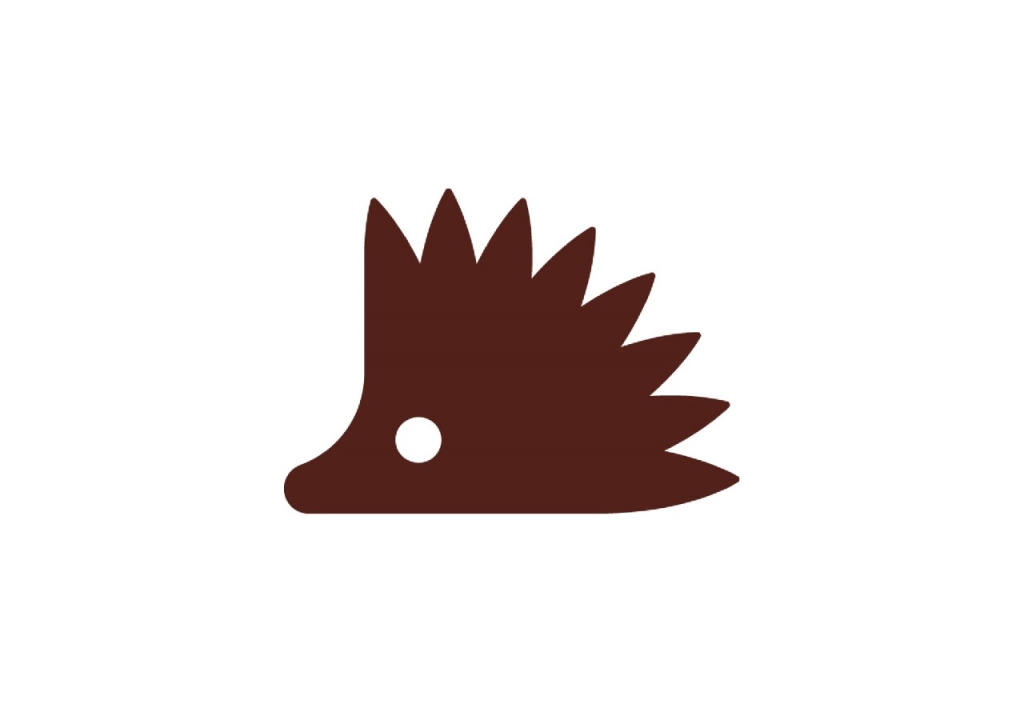


 Introduction


